Redesign with related design guidelines from Chapter 22: UX Design Guidelines in The UX BOOK.
Planning
i) Clear System Task Model for User
ii) Help users plan goals, tasks by providing a clear model of how users should view system in terms of tasks
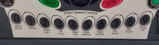
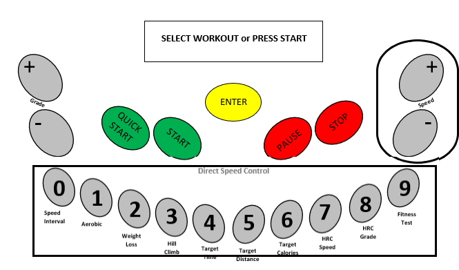
We support users’ high-level understanding of the whole system with a clear conceptual design, not just how to use one feature by maintaining presentations of the numeric keypad with listed workout plan under it, which users will know how to use for other workout plan beside AEROBIC. The structure are the same except if users choose to QUICK START, the system will pre set for the users.
- Help users with system model, metaphors, work context
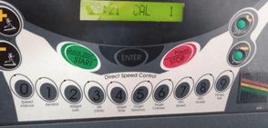
Every treadmill have their own interface, all the basics button are they but only how they are organized are different. In this T790 interface, we are maintaining all things except we design the QUICK START/START and PAUSE/STOP into independent button. In that way, it can supports the users’ overall understanding of the system, design concept, and any metaphors used with a clear conceptual design of the treadmill. Metaphors, such as the analogy of using a T75 Treadmill in a T790 Treadmill, are ways that existing user knowledge of previous designs and phenomena can be leveraged to ease learning and using of T790 Treadmill.
- Make clear all possibilities for what users can do at every point
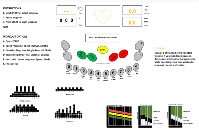
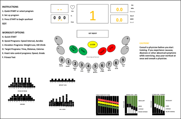
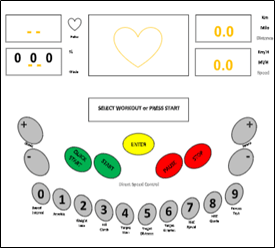
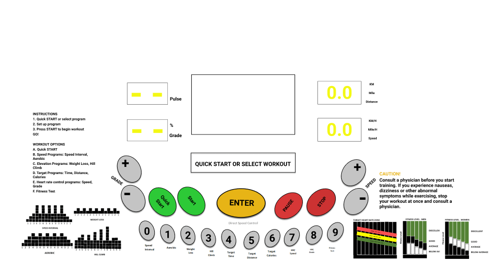
We help users understand how to get started and what to do next by maintaining the “QUICK START or SELECT WORKOUT” on the LED Bar. When the user see QUICK START, they know that the workout program all pre set for the user. They will automatically press START and begin to start the workout. While SELECT WORKOUT, the users know which button to press, which is NUMERIC KEYPAD. Under the numeric keypad, there will be a listed workout program, so the user will just press any numeric keypad with workout plan.
- Keep users aware of system state for planning next task
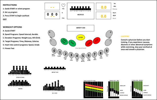
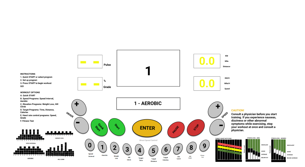
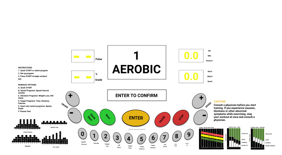
We to maintain and clearly display system state indicators when next actions are state dependent by stating what they are doing in current state. When the user SELECT WOKOUT AEROBIC, the LED BAR will show AEROBIC, so the users know what they are selecting.
Translation
Support users in sensory and cognitive actions needed using cognitive affordances to determine how to do a task step in terms of what actions to make on which object and how
1. Existences (of cognitive affordance)
- Program a LCM screen of treadmill to display each action that users are required to do in order for the user to complete the task. This is to help novice users to know/learn what actions are needed to carry out intentions.
i)
ii)
iii)
iv)
v)
vi)
vii)
viii)

2. Presentation (of cognitive affordance)
Cognitive affordance visibility
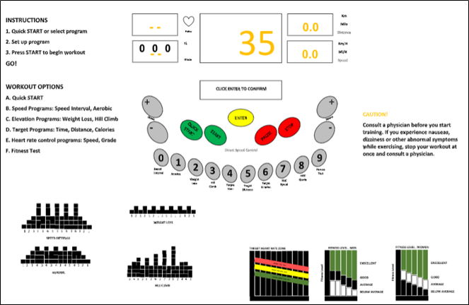
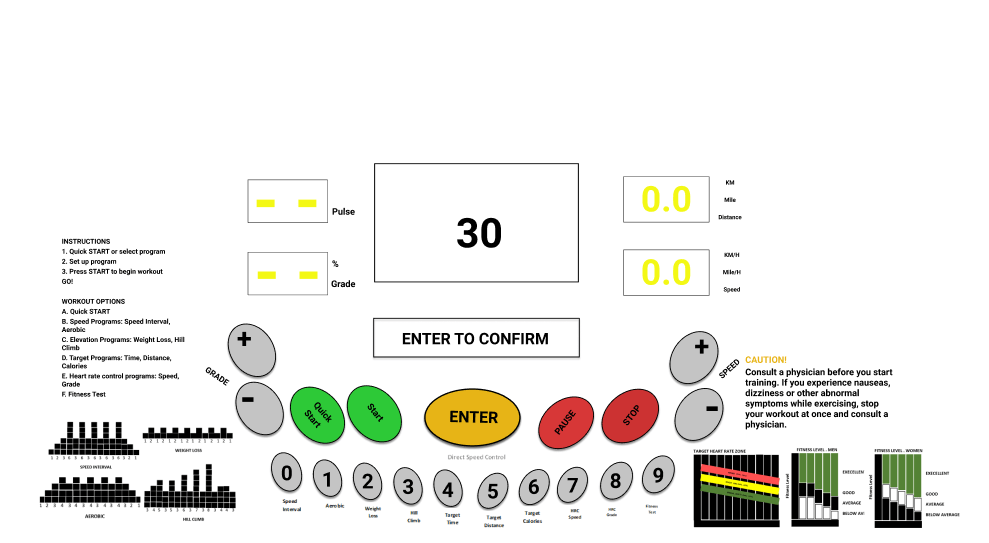
- The black color “Enter” button, change it into yellow color. We change it to yellow colour as yellow is a standout and eye-catching colour which offers the user a sense of warmth instead of urgency. This will make the user feels better about their choice during entering the input. It helps to ease burden during the process. Next, it is easily contrasted with just about any other color. The interface, which is mostly light-grey, but it is the yellow button that will sticks out the most. This allows the user to easily find the next step when to enter the selected workout program and inputs. Yellow can be a powerful color if used in moderation. That is why we use yellow colour only for Enter button as if yellow colour is used excessively throughout the interface, users sometimes connect it with being “cautious” (like a yellow light on a stoplight). To successfully use yellow, it should be limited only to specific elements with calls to action.

Cognitive affordance noticeability
- Change the black ashes “numeric keypad” button into light ashes color. This is to catch the human attention easily and prevent users from wasting their time seeking for it when the task is requiring pushing the “numeric keypad” button.

Cognitive affordance legibility
Change the instruction font into Helvetica font and the size of the 12. This is because the Helvetica font is a serried typeface that are better for the printed material as the serifs guide the reader’s aye along the line.

3. Content and meaning of cognitive affordance
Distinguishability of choices in cognitive affordance
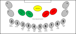
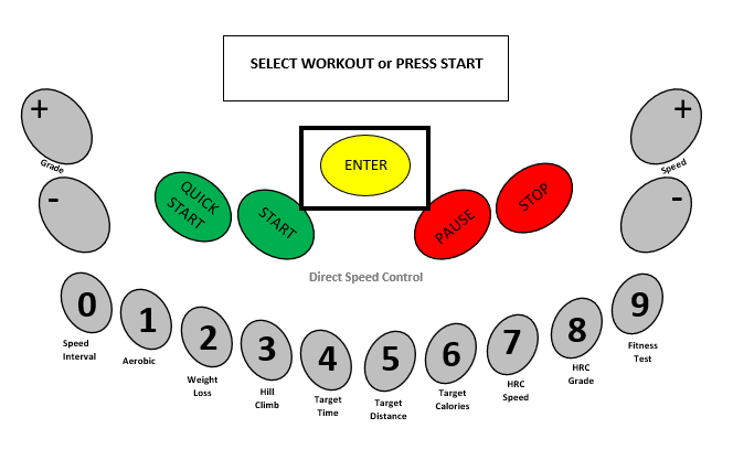
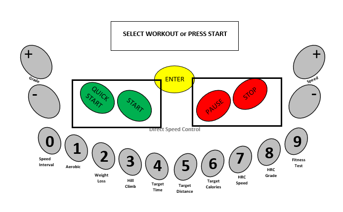
Separate the Quick start/start button to 2 separate buttons. This is to support the user usability to differentiate two possible choices and actions by distinguishable expressions of the meaning in their cognitive affordance which is the 2 separate buttons for the “Quick start” and “Start”.

Separate the Pause/Stop button to 2 separate buttons. This is also to support the user usability to differentiate two possible choices and actions by distinguishable expressions of the meaning in their cognitive affordance which is the 2 separate buttons for the “Pause” and “Stop”.

4. Task structure
Task thread continuity: Anticipating the most likely next step or task path.
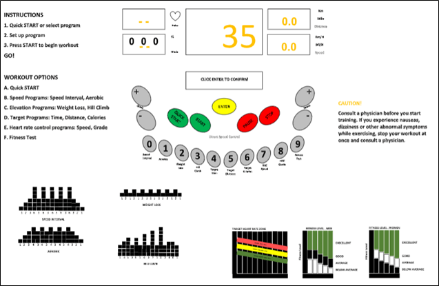
- Program the continuity of the task which each times the user input things, the LED bar of treadmill will display “Enter to Confirm”. This can provide the user to pursue a task thread of possibly many steps without interruption or “discontinuity”. Besides, it could help the user to predict on what to do in the next task.
Physical Actions
4.1 Sensing Objects of Physical Actions
- Sensing objects to manipulate
Support users making physical actions with effective sensory affordances for sensing physical affordances. Make objects to be manipulated visible, discernable, legible, noticeable, and distinguishable. When possible, locate the focus of attention, the cursor, for example, near the objects to be manipulated.
For example: Enter button, numeric keypad, speed, and grade buttons.
We do not redesign the shape of buttons rather we change the colour instead. The original button for the Enter button is black. Then we change it to yellow colour as yellow is a standout and eye-catching colour which offers the user a sense of warmth instead of urgency. This will make the user feels better about their choice during entering the input. It helps to ease burden during the process. Next, it is easily contrasted with just about any other color. The interface, which is mostly light-grey, but it is the yellow button that will sticks out the most. This allows the user to easily find the next step when to enter the selected workout program and inputs. Yellow can be a powerful color if used in moderation. That is why we use yellow colour only for Enter button as if yellow colour is used excessively throughout the interface, users sometimes connect it with being “cautious” (like a yellow light on a stoplight). To successfully use yellow, it should be limited only to specific elements with calls to action.
Next, we also change the colour of the numeric keypad, grade and speed buttons from black to grey colour. You use a darker font colour to make the labelling visible. In low light ambiance, user could still see or press the buttons as they can the feel the button with physical touch and the visibility of the labelling on the button. The button colour is completely contrast from the background. The sensory design is supporting the ability to locate the button of an intended physical action which is to increase or decrease the speed or choosing the number for workout program.
- Sensing objects during manipulate
Not only is it important to be able to sense objects statically to initiate physical actions but users need to be able to sense the physical affordance object dynamically to keep track of them during manipulation. The colour buttons of the interface is completely different from the background colour. It supports the the user’s dynamic sensory needs by showing an outline of the physical affordance button because the location of the buttons is visible. User will be able to make better judgement of the distance of button for every intended physical actions.
4.2 Help User in Doing Physical Actions
This part of the Interaction Cycle is about supporting user physical needs at the time of making physical actions; it is about making user interface object manipulation physically easy. It is especially about designing to make physical actions efficient for expert users.
Support user with effective physical affordances for manipulating objects, help in doing actions Issues relevant to supporting physical actions include awkwardness and physical disabilities, manual dexterity and Fitts’ law, plus haptics and physicality.
- Awkwardness and physical disabilities
In designing physical actions aspect, it is important to avoid awkwardness. It is the easiest aspects to find existing problems in UX evaluation.
i) Avoid physical awkwardness
Issues of physical awkwardness are often about time and energy expended in physical motions. The original interface required the user to press the Quick Start/Start button to start the treadmill manually as the first step which means the user cannot choose the workout program. If the user want to choose the workout program, then the user can only press the Quick Start/Start button after entering the inputs of for max. speed. Plus, user also need to press Stop/Pause button longer if want to stop the treadmill compared to pause the workout session. The button switching functions requires time consuming and effortful distraction of cognitive focus and visual attention. The button requiring multiple fingers on the same button can also be awkward user actions that hinder smooth and fast interaction. Thus, we separate both Quick Start/Start button and Stop/Pause button. This will helps the user to press the button for a split second and get feedback immediately after execute the actions. User will not get confused the function of both Quick Start and Start button as the LED screen will also support to display what the user suppose to do. Then, less effort is needed as the user sometimes presses the button harder to make sure the action is long enough to stop the treadmill. The split-second timing is crucial as the user want the immediate feedback.
ii) Accommodate physical disabilities
Based on the type of operation, there are visual and tactile feedback for the users. The buttons on the interface is pressable which the user can feels on the fingertips that the button is moving down when the user presses it. When users press on the button, they expect that the interface will respond with appropriate feedback. When the user press the button, “click” sound will be produced to show the action is succeed. Then, the user could observe the feedback after pressing the button where the button will light on. If the users does not get any feedback, they might consider that the system did not receive their command and will repeat the action. Such behavior often causes multiple unnecessary operations. Plus, the labelling on the buttons are emerged. Thus, the users can feel the labelling on their fingertips.
- Manual dexterity and Fitts’ law
In Fitts’ law are . In a strict interpretation, an error would be clicking anywhere except on the correct object. A more practical interpretation would limit errors to clicking on incorrect objects that are nearby the correct object; this is the kind of error that can have a more negative effect on the interaction. Manual dexterity is the ability to make coordinated hand and finger movements to grasp and manipulate objects.
i) Design layout to support manual dexterity and Fitts’ law Support targeted cursor movement by making selectable objects large enough .
In Fitts’ law, it states that the amount of time required for a person to move a pointer such as fingertips to a target area is a function of the distance to the target divided by the size of the target. Thus, the longer the distance and the smaller the target’s size, the longer it takes. For example, this law influenced the convention of making interactive buttons large (especially on finger-operated interface). Smaller buttons are more difficult and time-consuming to press. Likewise, the distance between a user’s task or the attention area and the task-related button should be kept as short as possible. At its most simple, the bigger an object is and the closer it is to the users, the easier it will be for them to reach it.
The buttons on the interface is big enough for the fingertips to avoid the users from mistakenly press on the wrong button.

ii) Group clickable objects related by task flow close together. But not too close, and do not include unrelated objects in the grouping
Small movement distances require less time and can lead to less targeting errors. Short distances between related objects will result in shorter movement times and fewer errors. We did not change the design of original buttons and add two more of same size buttons on the interface with different functions. Placing the buttons far apart will increase the time taken in performing the tasks in the interface. Grouping common buttons make finding similar objects easier.
The grouping of similar buttons on the interface will support manual dexterity and Fitts’ law. Support targeted fingertips movement by making selectable buttons large enough. The bottom line is simple which is a small button is harder to press on than large ones. As a result, users do not have to trouble figuring out which button to press on. Even if some of the buttons on the interface have the same colour but the labelling is totally different from each other to make the comparison process easier.
The numeric buttons is grouped as the selection of workout programs in one virtually curved line which have different labelling on the buttons. The users will be able to know where they need to press when choosing the workout program. Next, the Pause button (stop the treadmill temporarily) and Stop button (stop the treadmill completely ) are grouped on the right space meanwhile the Quick Start button (start the program manually) and Start button (start after choosing the program) are grouped on the left space.
Outcomes
- System Functionality
We do not redesign too many things in the system functionality of the interface. The numeric buttons act as selection of workout program and also for direct speed control. The users will be able to know its function as they can see the visible labelling for the numeric button. We separate the Quick Start and Start button and also Pause and Stop button. This will avoid misunderstanding of the buttons when users interact with the interface.
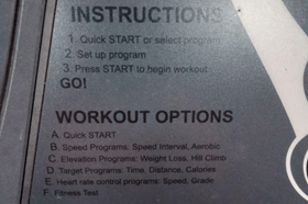
i) Press Quick Start button.
ii) Press Start button
iii) Press Pause button
iv) Press Stop button

- System Response Time
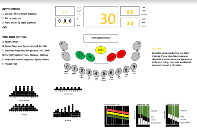
If the system response time is too slow or too fast, it can impact the users’ perceived usage experience. We decide to remove the 4 seconds rule when the users were asked to input the workout time and max. speed for the workout program. Users are unable to do the intended actions because they were given very less time to perceive each feedbacks. This will affect the interpretation process and cause some errors to happen. The goal will be difficult to achieve. There is no time limitation provided. The user can press the Enter button instead if they have done with the input process.
- Automation Issues
The automation concept only involve the numeric button. When the users want to choose the workout program, they need to press any numeric button that they have selected. For example, if they choose button with number one labelling, the LCM screen will display “1-AEROBIC”. The users know that number 1 button stands for aerobic program because of the clear and precise labelling below the number 1 button. Thus, they will be able to justify why “AEROBIC” displayed on LCM screen with number 1.
Assessment
Content and meaning of feedback
- Help users understand outcomes with effective content/meaning in feedback
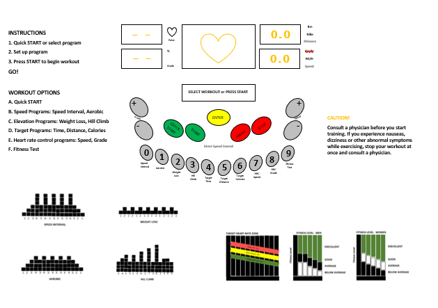
On the small LED Screen, during the workout, it will display 30:00 CAL 0 . Users will automatically know that 30:00 is indicate for time because previously they are set the time of workout for 30 minutes. While CAL 0 indicates calories burn which is CAL is short form for CALORIES.
- Clarity of Feedback
- Design feedback for clarity
All the words in the system are precise wording. We do not use the unfamiliar words such as “SNAP ENTER TO CONFIRM”, but we use “ENTER TO CONFIRM”. Simple and straight – forward.
- Support clear understanding of outcome (system state change) so users can assess effect of actions
- Give clear indication of error conditions
When the user input more than 100, for example the level of elevation is 222, the system will output “OUT OF RANGE” which means the range are not more than hundreds.
- Precise wording
We used to make the word precise such as “INPUT MAX. ELEVATION” rather than “PLEASE USER INPUT THE MAX. ELEVATION” which it will take more time for users to read and loss time at that state.
- Give enough information about the possibilities or alternatives so users can make an informed response to a confirmation request
- Tone of feedback expression
- Design feedback wording, especially error messages, for positive psychological impact
When the users input that more than 100, it will output “OUT OF RANGE”, which it will give calm and relax.
- Consistency of feedback
- Be consistent with feedback
- Label outcome or destination screen or object consistently with starting point and action
The feedback are located at small rectangle LED under the screen. “ENTER TO CONFIRM” always located in the middle in small rectangle LED under the screen, so everytime the user want to confirm it, they will not find where actually the confirmation located.
Presentation of feedback
- Support user with effective sensory affordances in presentation of feedback
There will be a tactile feedback for the user after they press the button. Users will feel the button lower down from the interface that indicate it has been pressed.
- Feedback visibility
- Make feedback visible
When the user press the numeric keys that indicate workout plan, the button will lights up.
- Feedback noticeability
- Make feedback noticeable
Colour of the button are contrast with the background. The button colour is dim grey, while the background is light grey.
- Make feedback large enough to notice
The whole button numeric keypad will lights up when the users press it. Besides, when the user press the button, it will give sound “click” to indicates the user that they have been pressed the button.
- Feedback legibility
- Make text legible, readable
We use Helvetica font, and size 12 for the instructions, while for workout plan that located under the numeric keypad will have size 10 with the same type of font. We use Helvetica font because that serifed typefaces are better for printed material, because the serifs guide the reader’s eye along the line.
- Feedback presentation consistency
- Maintain a consistent location of feedback presentation on the screen to help users notice it quickly
The feedback are located at small rectangle LED under the screen. “ENTER TO CONFIRM” always located in the middle in small rectangle LED under the screen, so everytime the user want to confirm it, they will not find where actually the confirmation located.
Existence of feedback
- Request confirmation as a kind of intervening feedback
We make the system to output “ENTER TO CONFIRM” after the user input the “QUICK START or SELECT WORKOUT”, “INPUT WORKOUT TIME”, “INPUT MAX ELEVATION”, and change speed in order for them to do a confirmation before the task proceed.
- But do not overuse and annoy
The confirmation word that we put are simple and straight – forward.
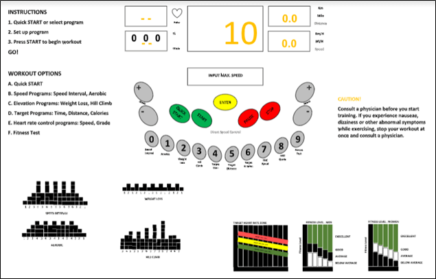
LED BAR : QUICK START or SELECT WORKOUT
USER : INPUT “1” (AEROBIC)
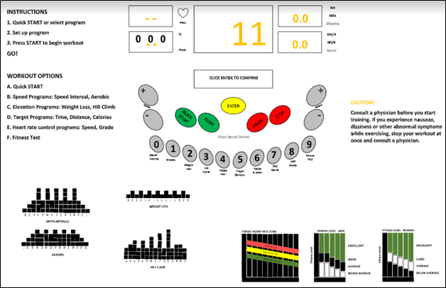
LED BAR : ENTER TO CONFIRM
USER : INPUT “ENTER”
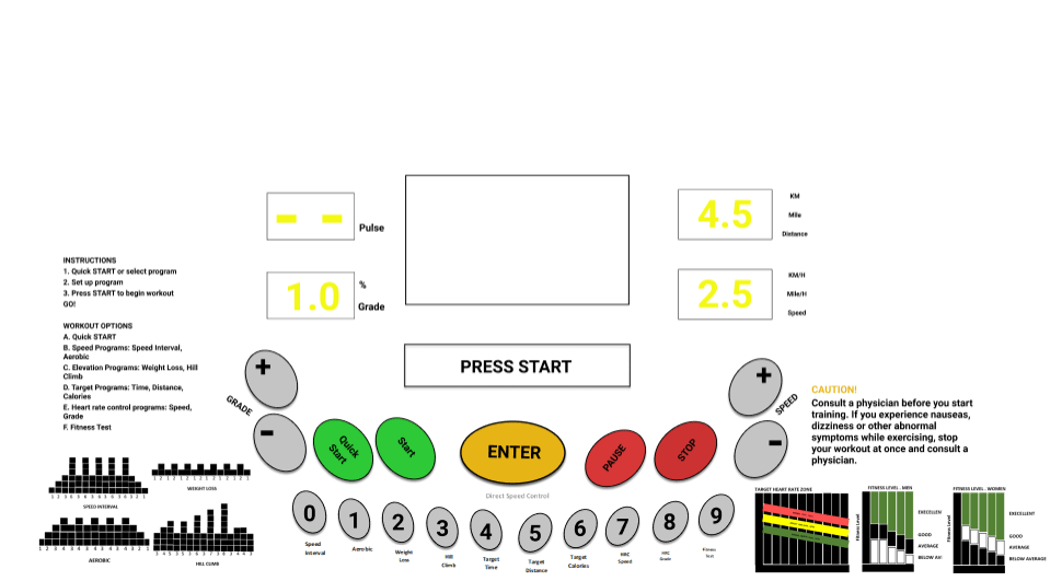
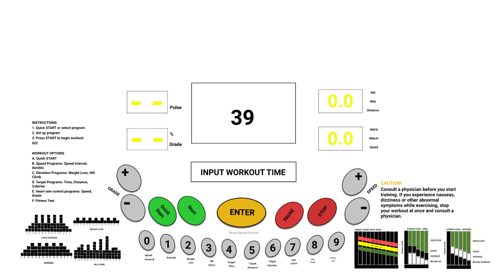
LED BAR : INPUT WORKOUT TIME
USER : INPUT “45” BY USING “NUMERIC KEYPAD” OR “+/-“
LED BAR : ENTER TO CONFIRM
USER : INPUT “ENTER”
LED BAR : INPUT MAX ELEVATION
USER : INPUT “15” BY USING “NUMERIC KEYPAD” OR “+/-“
LED BAR : ENTER TO CONFIRM
USER : INPUT “ENTER”
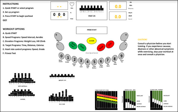
LED BAR : PRESS START
USER : INPUT “START”
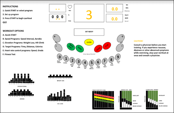
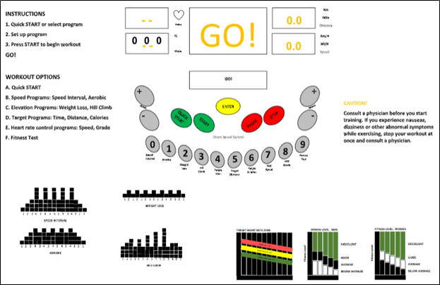
LED BAR : 3, 2, 1, GO! DISPLAY STATUS (IN GRAPH)
USER : (START WORKOUT AEROBIC)
USER : INPUT “4” USING “NUMERIC KEYPAD” OR “+/-“
LED BAR : CHANGE SPEED -> 4 … ENTER TO CONFIRM
USER : INPUT “ENTER”
TREADMILL : CHANGE SPEED TO 4
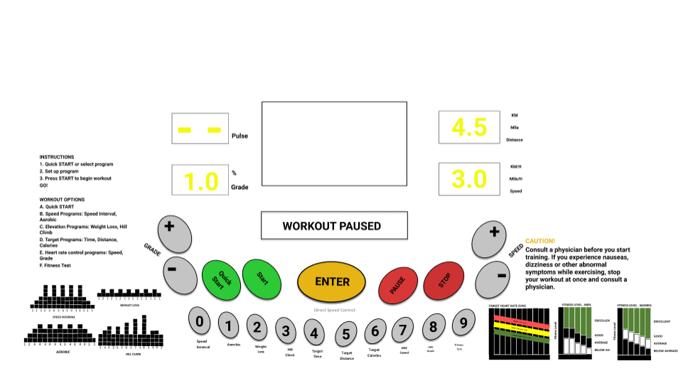
USER : INPUT “PAUSE”
LED BAR : WORKOUT PAUSED
USER : INPUT “STOP”
LED BAR : WORKOUT STOP … DISPLAY STATUS
 HUMAN FACTORS & ERGONOMICS