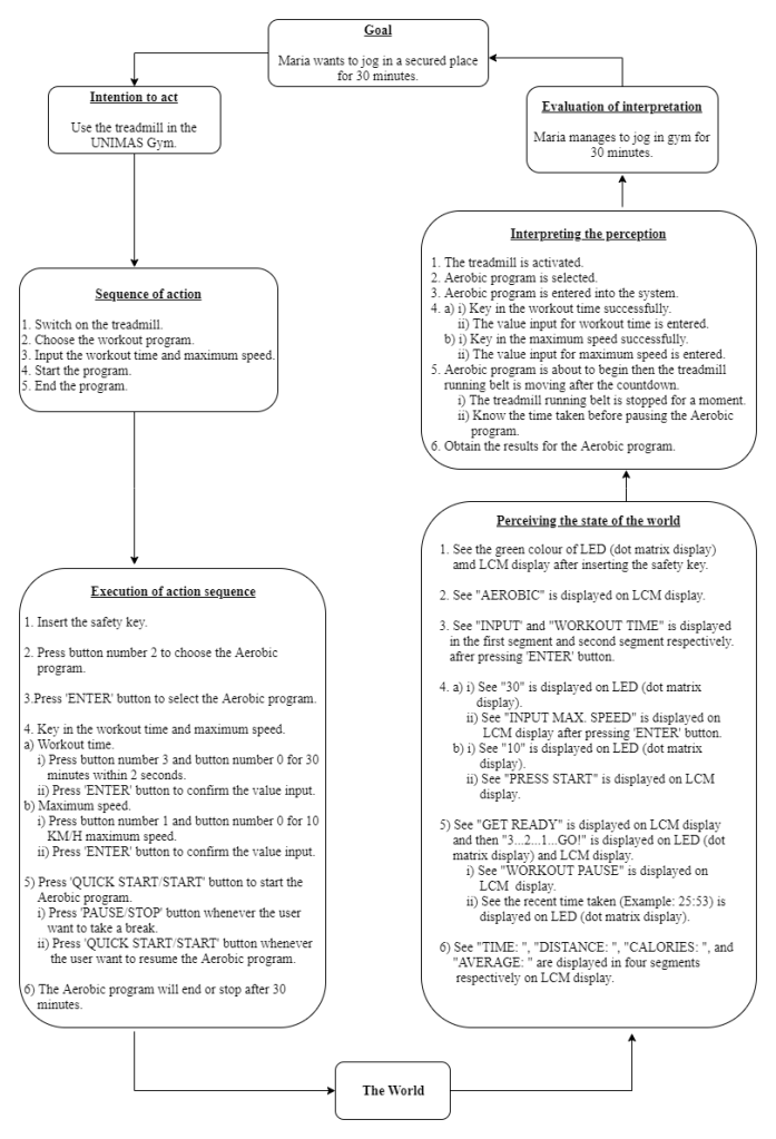
Selected Work System Interface
Brand: Healthstream
Discovering Requirement
User
Maria is a second year undergraduate student at Universiti Malaysia Sarawak (UNIMAS). She is a full time student in Bachelor of Finance of Faculty of Economy and Business. She is 21 years old. Maria actives in events or activities held by her college or faculty. Plus, she has position in her club. She spend less time to exercise due to tight schedule. Maria used to practise indoor exercise. One of her favorites routine is jogging but she feels uncomfortable to jog in because of the unsecured environment. Thus, she has her own treadmill at home. Since she enroll to UNIMAS, she rarely has time for herself because of tight schedule. Now, she want to practise her old exercise routines to gain her stamina as a busy student.
Task
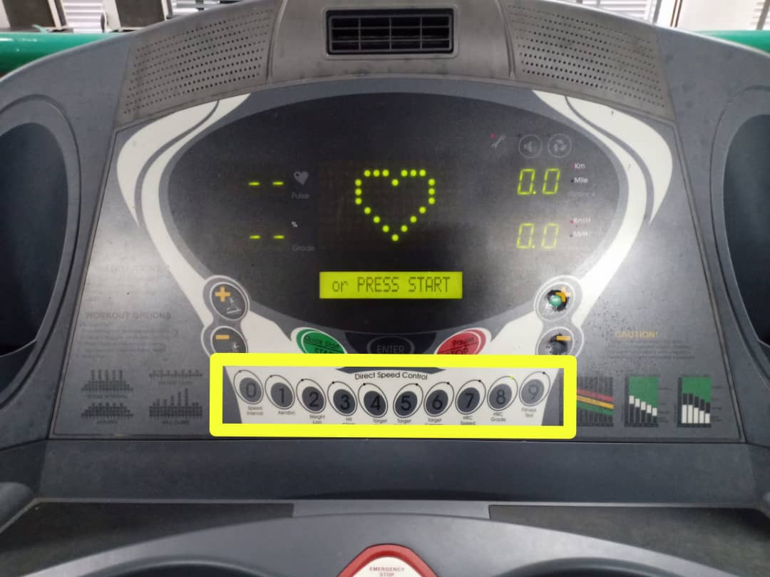
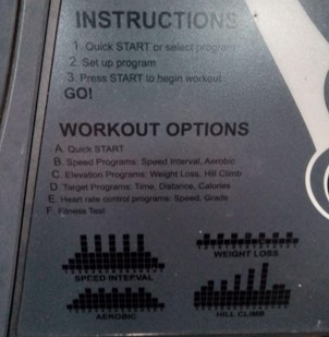
Task : Use the treadmill to do an indoor exercise
Specific task : Want to choose aerobic program on the treadmill.
1. The user need to insert the safety key to switch on the treadmill.
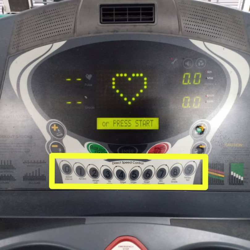
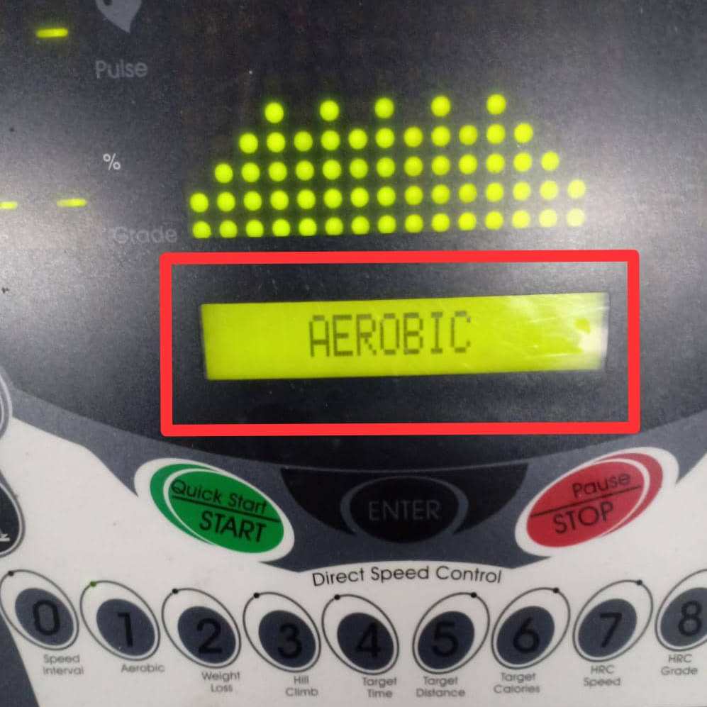
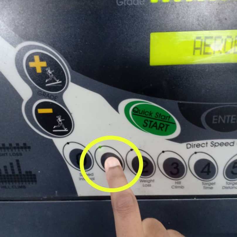
2. The user need to press the numerical button to choose the aerobic program: Key 1 or button 1

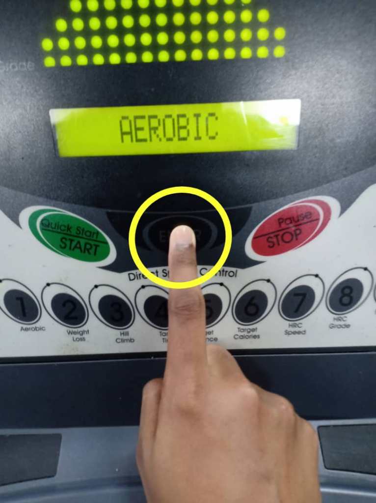
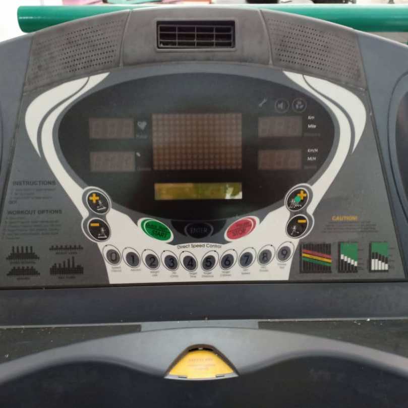
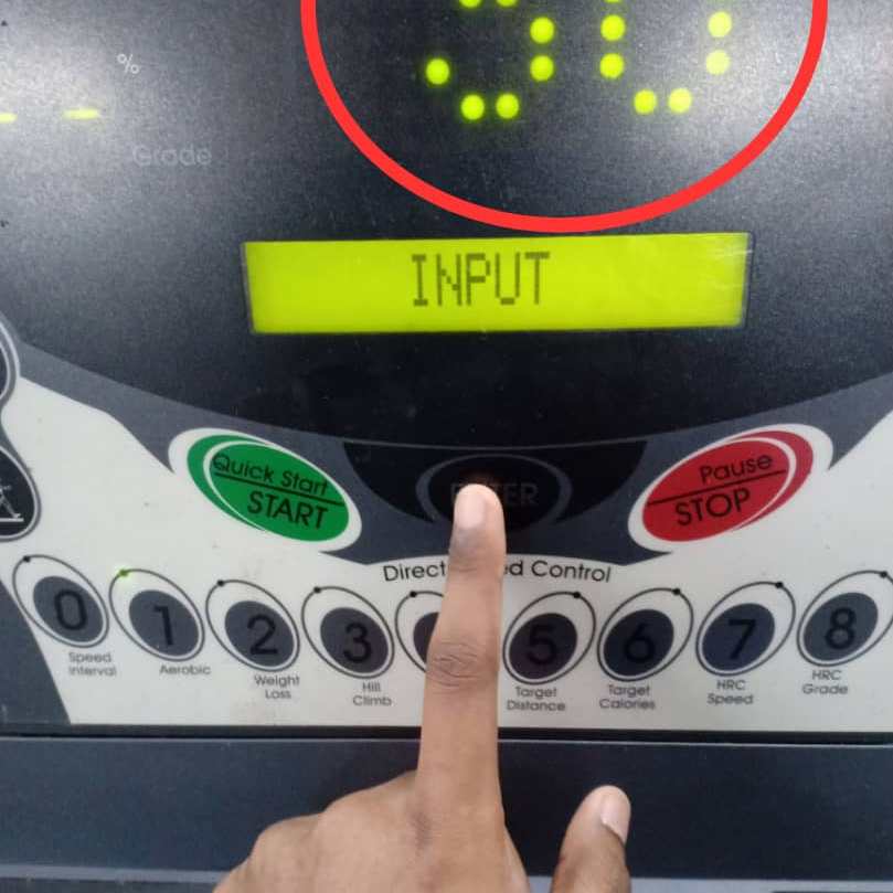
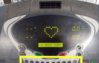
3. a) The LCM will display the type of workout program on the screen. “AEROBIC” will be displayed on the screen.
b) The user needs to press ‘ENTER’ button to select the ‘AEROBIC” program.
4. Key in the workout time and maximum speed.
a) Key in the value for workout time.
i) If in two seconds after number is entered, but ‘ENTER’ button is not pressed, then the LCM will display “ENTER to confirm”. If user pressed ‘ENTER’ button automatically after value input, then this message does not need to display.
ii) If the user does not enter the number in 2 seconds, then the LCM will display “ENTER to confirm” as the system will set the workout time automatically.
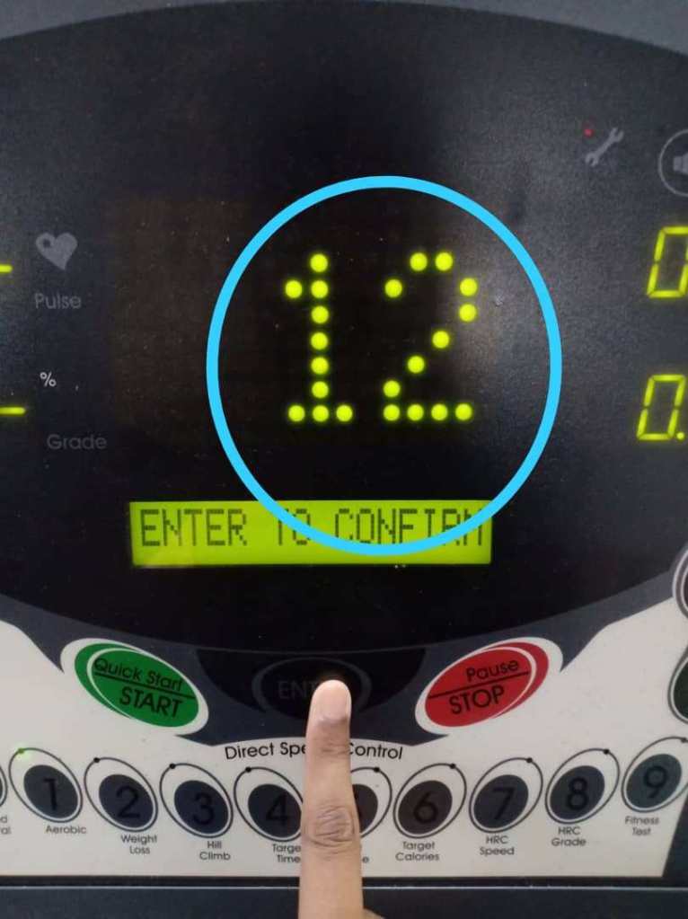
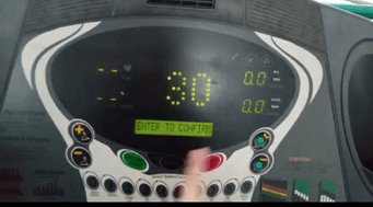
The user need to press the numerical button to key in the value for workout time. Press button number 3 and press button number 0 for 30 minutes Aerobic program in 2 seconds.
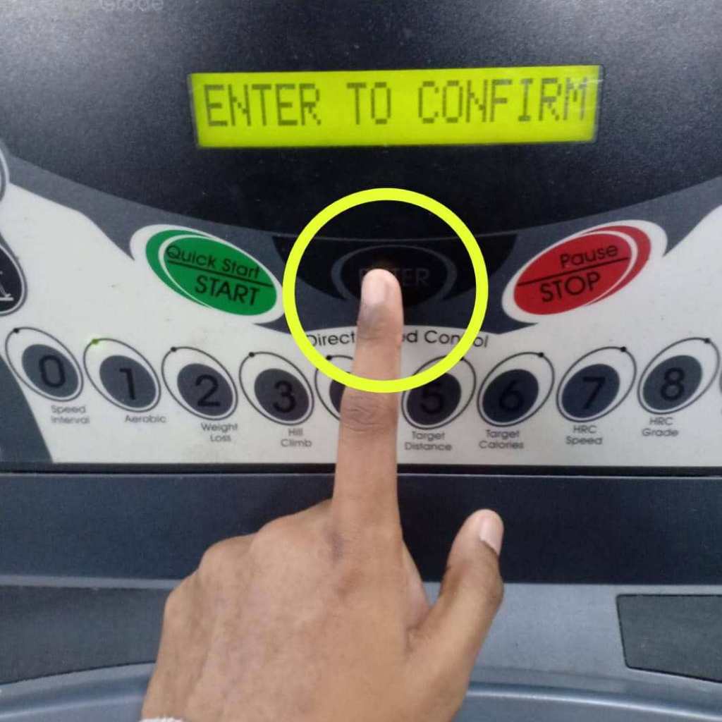
The LED (dot matrix display) will display ’30’ which represents the workout time. The LCM will display ‘ENTER TO CONFIRM’. The user need to press ‘ENTER’ button to confirm the value input or workout time.


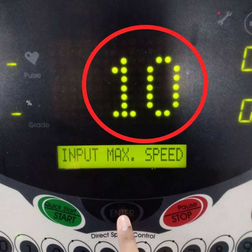
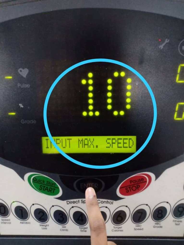
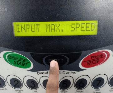
b) Key in the value for maximum speed.
i) If in two seconds after number is entered, but ‘ENTER’ button is not pressed, then the LCM will display “ENTER to confirm”. If user pressed ‘ENTER’ button automatically after value input, then this message does not need to display.
ii) If the user does not enter the number in 2 seconds, then the LCM will display “ENTER to confirm” as the system will set the workout time automatically.
The user need to press the numerical button to key in the value for maximum speed. Press button number 1 and press button number 0 for the 10 km/h maximum speed in 2 seconds.
The LED (dot matrix display) will display ’10’ which represents the maximum speed. The LCM will display ‘ENTER TO CONFIRM’. The user need to press ‘ENTER’ button to confirm the value input or maximum speed.
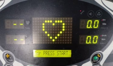
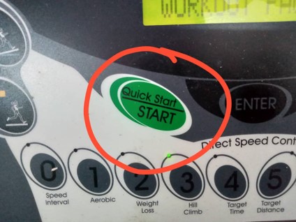
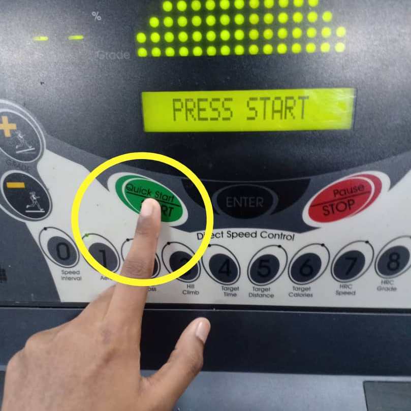
5. The LCM will display “PRESS START”. The user need to press ‘QUICK START/START’ button to begin the Aerobic program.
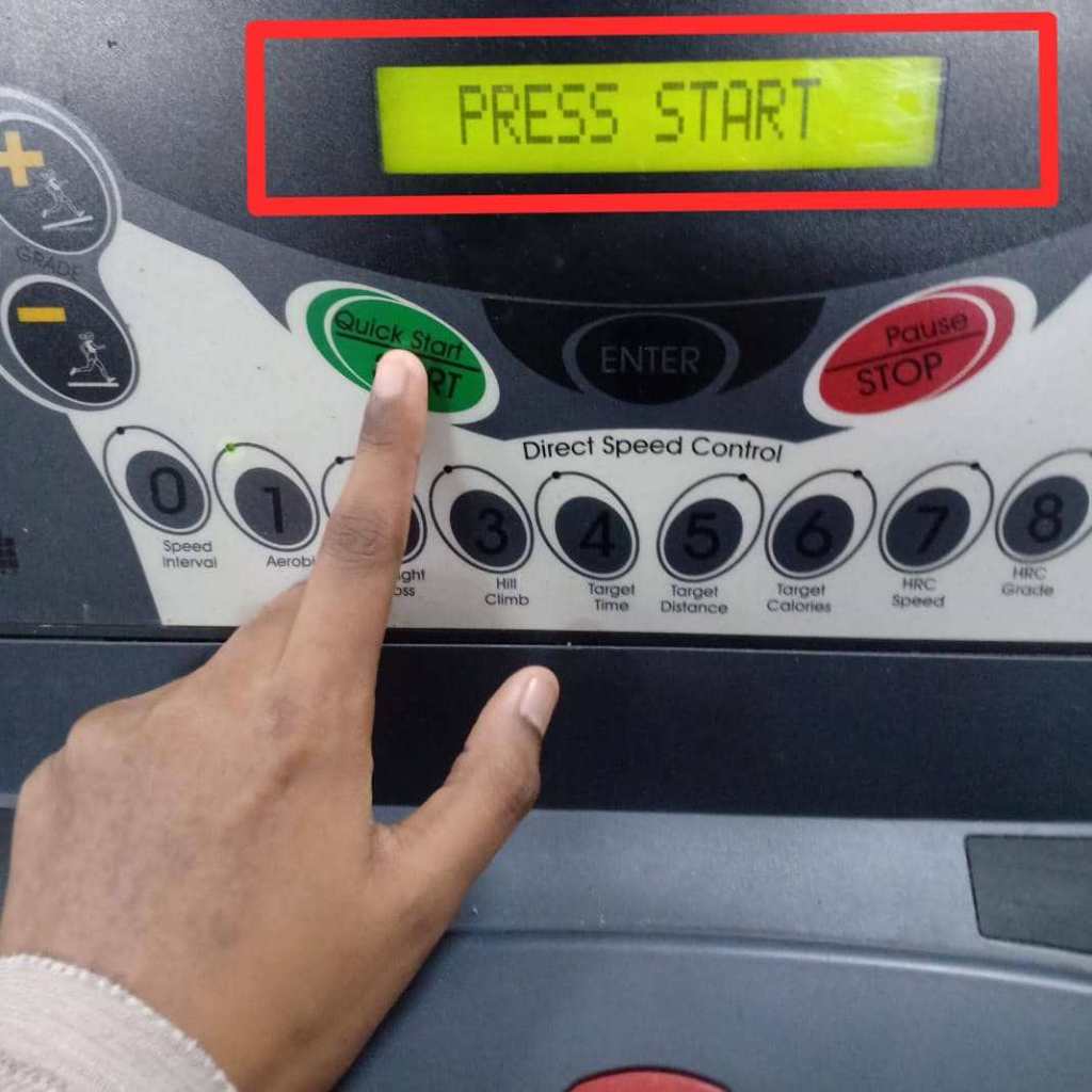

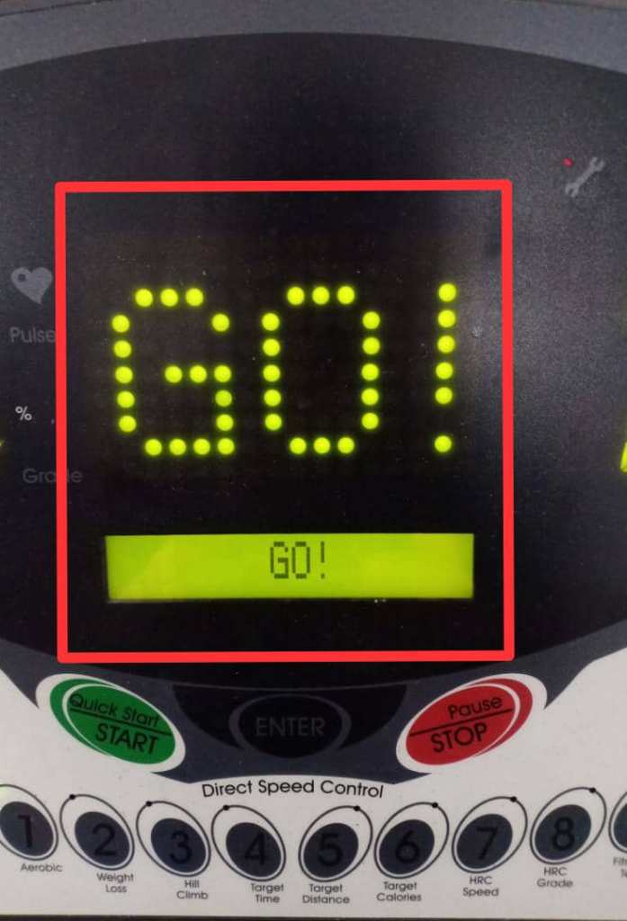
i) If the user presses ‘QUICK START/START’ button, LCM will display “GET READY”. Then, the LCM and LED (dot matrix display) will start to count down “3…2…1…GO!”.
ii) The treadmill will activate speed and elevation based on the Aerobic program. (Level 1)
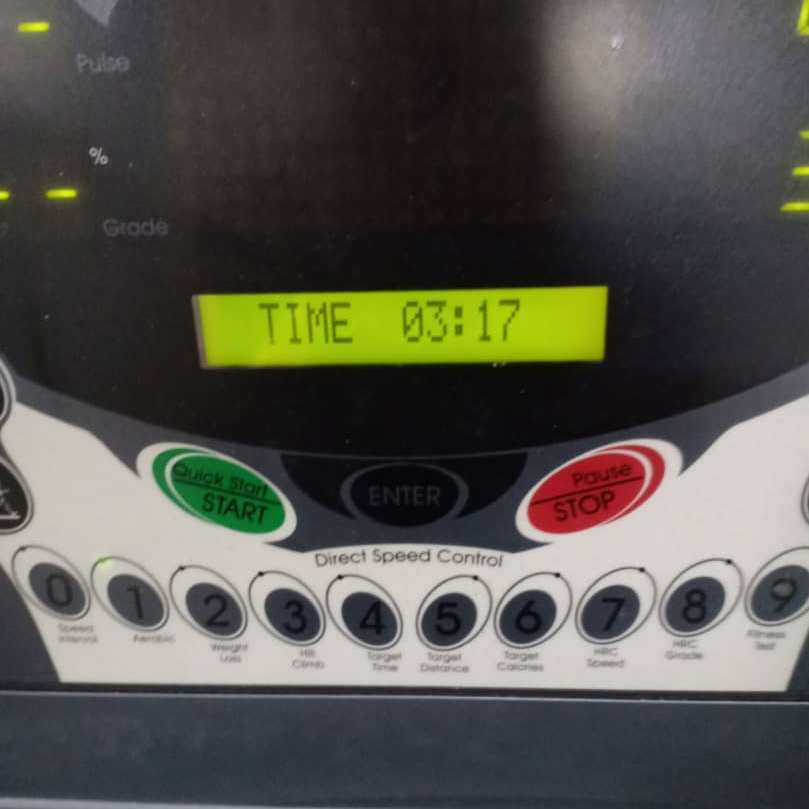
iii) The system will count down the time during workout session. The user can refer to the LCM display to see the time.
iv) During workout session, user can changes the program speed. The remaining program will scale up or down automatically.
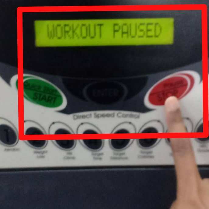
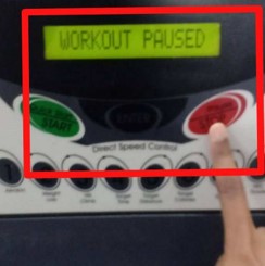
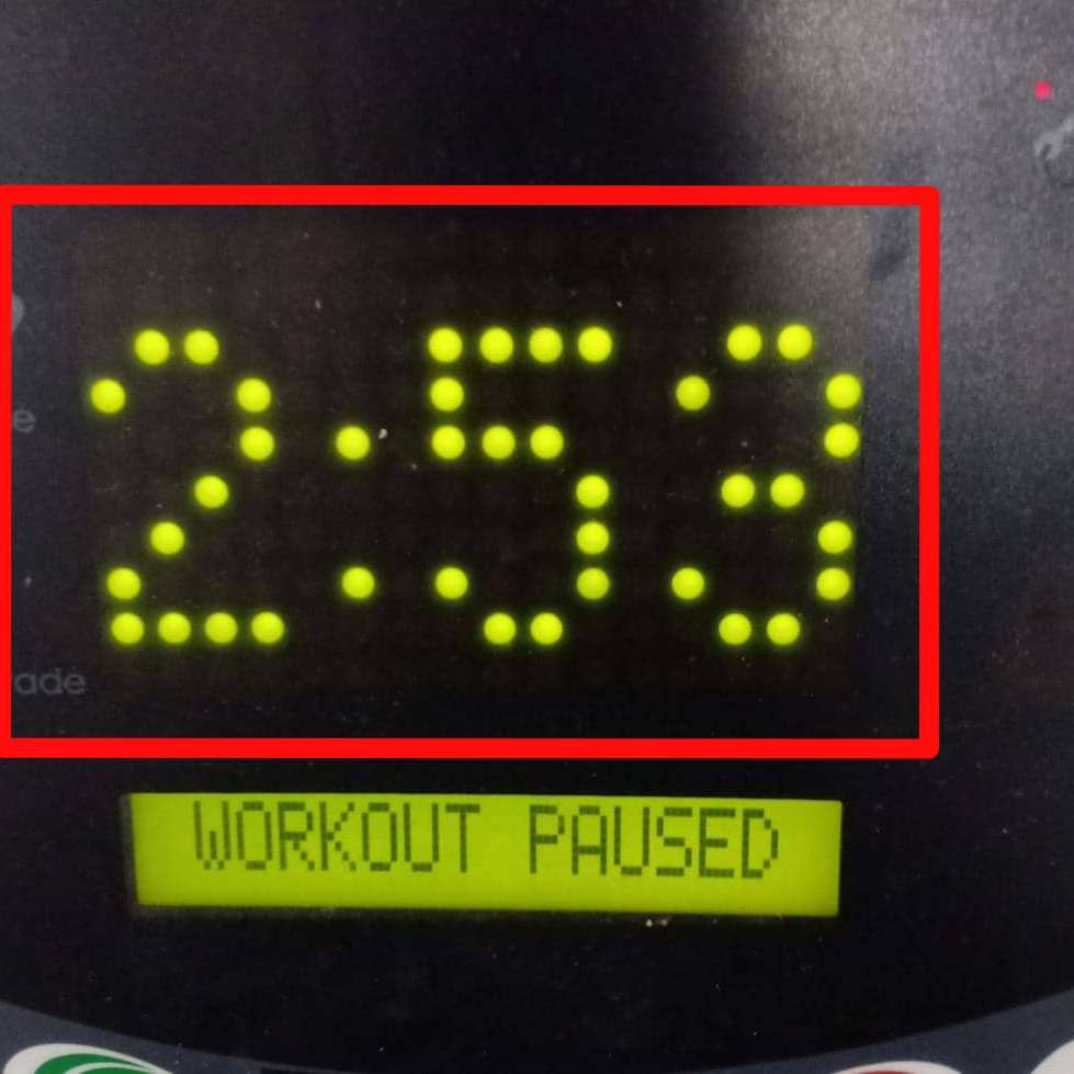
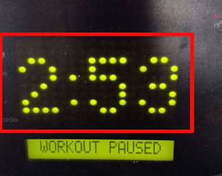
v) User can presses the ‘PAUSE/STOP’ button if want to take a rest for a moment. The LCM will display “WORKOUT PAUSED”. The LED (dot matrix display) will display the recent Aerobic program time.
Example:
The user press the ‘PAUSE/STOP’ button at 2 minutes and 53 seconds during the Aerobic program. The LCM will display “WORKOUT PAUSED” and the LED (dot matrix display) will display ” 2:53″.

The user needs to press ‘QUICK START/START’ button to continue the Aerobic program.
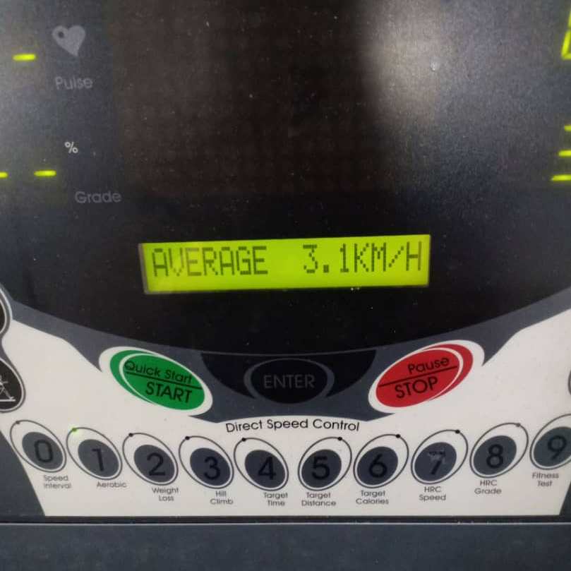
6. The Aerobic program will continue for 30 minutes. After 30 minutes, the Aerobic program will stop. At the end of workout, the LCM display will provide Aerobic program results which are the .total values for calories, distance, time, and average speed.REPORT THIS ADREPORT THIS AD
Example:
Environment
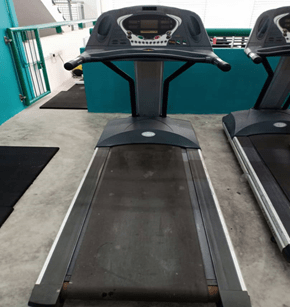
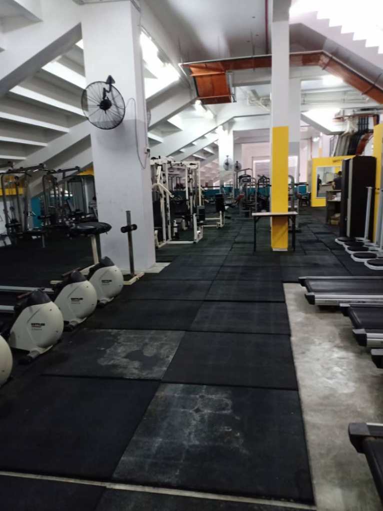
- Indoor (UNIMAS Gym)
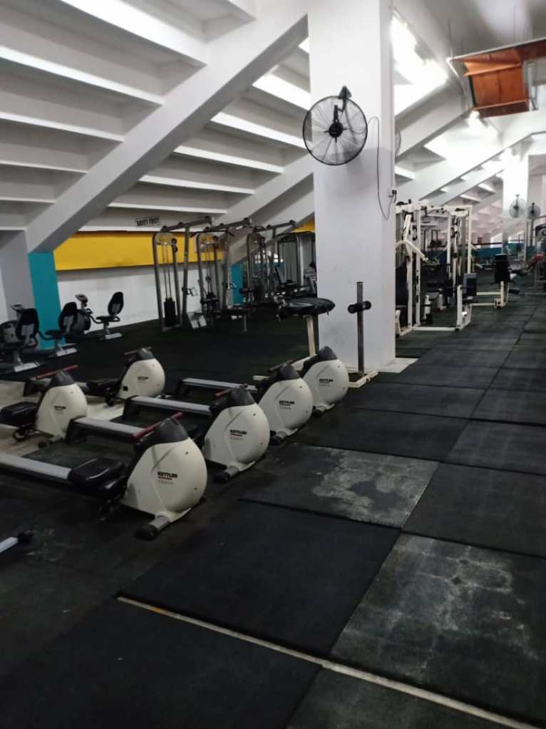
The selected treadmill is located in the gym at UNIMAS Gym. The environment is secured as it requires membership to use the gym. The gym is not crowded with the users as they come at different time and day. Thus, not everyone are using the UNIMAS Gym.
- Noise
The level of noise in the UNIMAS Gym is very low as people come at different time. There is no peak hour where the gym is fully packed with people. The peace environment allows the users to focus on their exercise routines without being disturbed.
- Light
The lighting in the gym is normal. The light intensity is not too high and low. The gym users can experience a better view when using the equipments. It allows less risk of doing error when using the equipments especially the treadmill. The treadmill interface needs a good lighting from the environment to allow the user see the labels or buttons clearly. Thus to avoid error, a sufficient amount of light can help the user to use the interface efficiently.
- Temperature
The gym provides a sufficient number of fans. There is no air conditioner provided in the gym. The temperature is normal as it is not too high or low which allows the gym users to be comfortable with the gym atmosphere. Even though the gym is located in a room or closed area, it is not too humid when the outside temperature is high. But the users could still feel the heat or a little bit hot in the gym if they do not switch on the fans.
- Equipment.
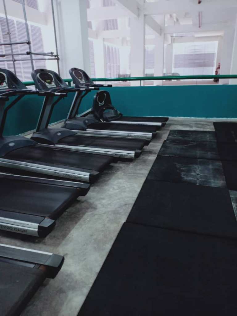
There are about five treadmills provided by the UNIMAS Gym. The treadmill section is not crowded with users as they use different equipment at different time.
Usability of The Interface
Display
- Dynamic display
The display changes with input and feedback from the system.
Example:
Whenever and whatever the user enter the input for speed and workout time, the LED (dot matrix display) will display the input. This shows that anything displayed on the LED (dot matrix display) is temporary and can be changed.
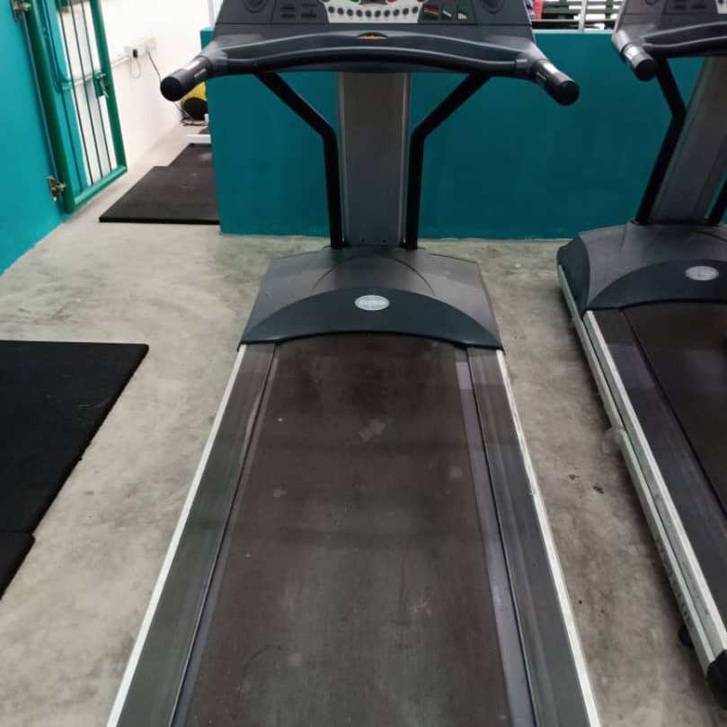
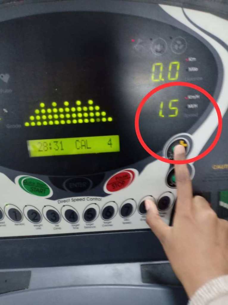
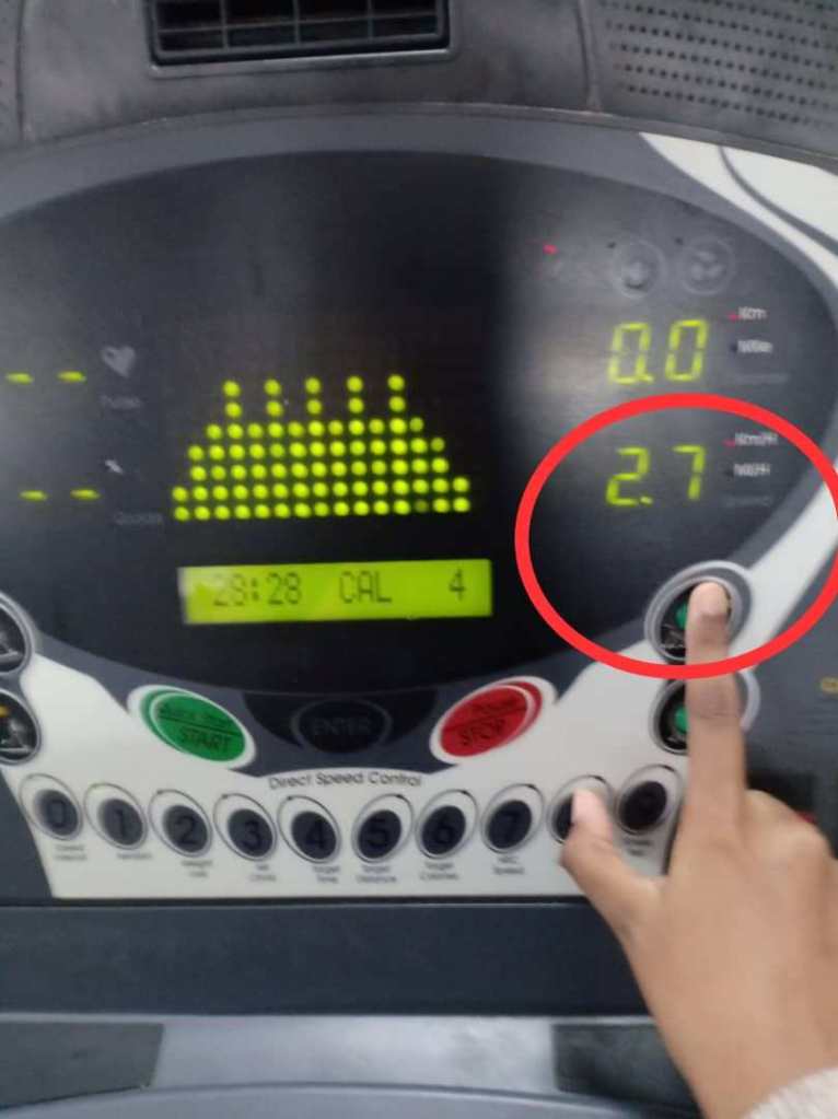
The LCM will display the speed of the running treadmill belt and the distance. The displayed speed can be changed anytime when the user slow down or speed up the workout program. The left image below shows that the initial speed of the treadmill belt which is 1.5 KM/H. The right image shows that the user increasing the speed up to 2.7 KM/H.
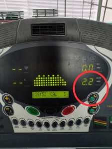
- Quantitative display
Next, the treadmill interface also applied the quantitative display. Quantitative display will shows the exact information. Quantitative display is basically means that it is capable of being measured or it has a quantity. Quantitative displays are by definition those that provide information in measurable amounts (Reising & Emerson, 1985)
Example :
A quantitative speed reading would show that user is running or jogging at 2.2 kilometres per hour on the LCM.
Control
Control allows the user to communicate with the interface and to manipulate them. Control can enable the users to direct the machinery that can help them to generate more power and to reduce effort and risk. Control helps to transmit information to an interface. When the users use a control, information is transferring from them to the interface. The user will gather information from the object via feedback.
- Discrete control activation.
The treadmill interface applied the discrete control activation. Discrete control activation use a limited number of conditions, for example, a light switch, which is either on or off. Feedback is an important feature of discrete controls. Discrete control activation is simple and has fixed magnitudes of information provided to the work system. This kind of control is used when it involves a small mechanical force to perform the task.
Example:
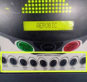
The buttons on the interface provides tactile feedback. When the user presses the button, it will move downward to let the user knows if the action is completed or not. The tactile feedback provides the user with clear information of the buttons movement.When the user presses the number 1 button, the fingertip able to feel the exerted forces to the surface of the buttons. The user can feel when the button is pushed downward. A clear and well-specified labelling helps the users to perform the task well even though the button has the same shape or colour. The numerical buttons have the same colour and shape but the clear labeling under each button helps the user to perform the task easier. The user will press the button with number 1 on it for Aerobic program

The tactile feedback is also supported by the visual feedback. The light that turns on when the button is pressed. Also, the LCM will display information for every pressed button by the users. Thus, the users know the the changes that occur when they press the button. The users will receive the visual feedback when the users press the number 1 button, the small green light will turns on. This shows that the task is completed. After the user press the number 1 button, the LED and LCM will display the information related to the function of the pressed button which also helps the user to know whether the button is completely pushed down or not.
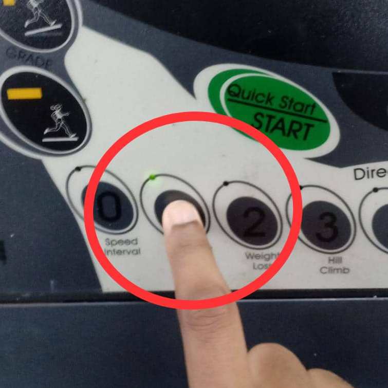
The small green light is turned on when the button is pressed meanwhile the LCM will display the selected workout program which is Aerobic program.
Usability: Issues
- Poor system task model.
The interface was not designed to match user’s conception of high-level task organisation – instruction given is not clear, confusing and complex. The interface features are not understandable by the user in term of their work context albeit knowing they exist – confuse with the quick start/start button – when to use it?

- Poor task efficiency
The interface is very inefficient in term of letting the user complete their task – the user cannot cancel their sequence of action and had to proceed even when error was made. No progress indicators – user are not aware of the task progress, what had been done and what is left to do – since the interface require multiple similar yet repetitive steps, users can lose track of they are in the task.

- Poor error recovery
There is no clear way to undo and reverse actions §There is no clearly marked exit for user to exit the sequence of actions if they wrongly selected an option or want to cancel it – interface does not give enough alternative for user needs

- Too many modes
cause abrupt change of meanings of user actions §The modalities are extremely confusing and are not distinguished clearly – what does aerobic or weight loss program do?
- The sensory design for physical affordance for physical actions is low.
the buttons instructions are barely visible, noticeable and distinguishable in low light §non backlit keys and low contrast labels was used in the design
- The presentation complexity of control cognitive affordance was ineffective in terms of organisation and layout
Too many screen clutter and the interface is a mess, making user difficult to locate and be aware of certain symbols and instructions.

- The design layout for clickable objects are too close and can cause error during manipulation
Easy for user to click the wrong button due to the close proximity of target object with non-target objects §Ex : Quick Start and Start, Pause and Stop
Error
Wrong actions by the user that is not intended by the designer. For this interface, Consequences of action was not made available and No error recovery exist hence all actions are irreversible.
Errors found by Maria :
1. Accidentally press the Quick Start/Start button. She need to press the numerical key with number 1 on it first to insert the program. If she presses the Quick Start/Start button, the system will decide or start the program manually.
2. She does not aware of the Enter button as she can barely its visibility.
3. She is given only 4 seconds to change the workout time set by the program (30 minutes).
4. She is given only 4 seconds to change the speed of treadmill (10km/h).
5. She does not sure how to change the speed during the program. The system provides two ways to change the speed.
6. The Stop/Pause button is confusing her as the button need to press longer to stop the treadmill compared to pause the workout session.
Error – System Approach
Error occur due to interaction between system components. Direct causal factor in this scenario: The control and display of equipment are poorly designed and difficult to understand.
Type of error : Error of commission
An action is performed incorrectly. It happens in the execution stage where a plan is implemented by the process of carrying out the actions specified by the plan.
- Error – Accidentally press the Quick Start/Start button.
Maria needs to press the numerical key with number 1 on it first to insert the program. If she presses the Quick Start/Start button, the system will decide or start the program manually.
- Human Error Classifications of Mistakes:
Rule-Based Mistakes because the situation is mistakenly interpreted. When the users perceive the Quick Start/Start button, it gives them an idea that its function is to start the process. The users implore wrong plan as they follow inappropriate rule.
Error – Generic Error Modelling System
Three level of cognitive task processing which error can occur at each level:
1. Skill-Based : automatic procedural task ; slips
2.Rule-based : task approached by pattern matching from a set of internal problem solving rules
3.Knowledge-based : task approached by reasoning from first principle
In this case, the errors occur at :
i) Rule-Based mistakes where usually a result of picking an inappropriate rule caused by misconstrued view of state, overzealous pattern matching, frequency gambling, deficient rules.
For example:
- User are given only 4 seconds to change the workout time set by the program (30 minutes) and the speed of treadmill (10km/h).
Impact : The confirmation feedback with timer is overuse and annoying as the upcoming action is not destructive to user. It makes user feel pressured when they don’t even know the consequences of their choice which cause a bigger error.
ii) Knowledge-based mistakes where usually due to incomplete or inaccurate understanding of system, confirmation bias,or overconfidence.
For example:
- User can press + symbol button and numeric keys to increase the speed at the same time.
Impact : Same button with different functions make the users confuse during executing the tasks.


- User can press Quick Start/Start button to start the program at the same time. Also, the user did not know how long to press the keys. The user needs to press the Quick Start button in short period meanwhile Enter button have to be pressed in long period.
Impact: The awkwardness between the users and interface happens when the users cannot see the feedback whether the task is succeed or not. The users are unable to see the feedback when press the Quick Start/Start button in short period because they are supposed to press it in long period.
- For Pause/Stop button, the duration to press pause or stop is different. So the user did not know which one have to press long (stop or pause). To pause the program, user needs to press the button in short period meanwhile press the button in long period to stop the program.
Impact: The awkwardness between the users and interface happens when the users cannot see the feedback whether the task is succeed or not. The users are unable to see the feedback when press the Pause/Stop button in short period to stop the program because they are supposed to press it in long period.
iii) Memory-Lapse Mistakes where usually an interruption that leads to forgetting the evaluation of the current state of the environment.
- After input the program, it ask about workout time. User are given only 4 seconds to change the workout time set by the program (30 minutes) then change the speed of treadmill (10km/h) afterwards with the same 4 second limit. The user is distracted by the info on the LED screen. They did not know what is 2 : 53 is stand for.
Impact: The users are unable to redo the input process and have to proceed or start the process all over again.
Gulf of Execution and Gulf of Evaluation
In every interaction with an interface, users have to overcome the challenges of understanding the current state of a system and finding out ways to change it. A designer should focus on these gulf; gulf of execution and gulf of evaluation, and bridging them with a transparent conceptual model. The gulf of evaluation evaluation is for understanding the state of the system and the gulf of execution is for taking action to accomplish a specific goal. Without effective design elements to support users, these gulf can become an overwhelming barriers between users and their goals.
Gulf of Execution
A successful execution usually depends on correct evaluation. It was easy to formulate an action plan to use the system, but any plan based on faulty evaluation is doomed to failure.
The gulf of execution is moderate. During the execution part, user cannot figure out how the system operate especially when selected actions failed. System is hard to be directly perceived and interpreted in terms of the expectations and intentions of the user. The action possibilities of the system do not match the intended actions of the user.
For example:
- The instruction is too simple but when the user perform the task, it is more complicated.
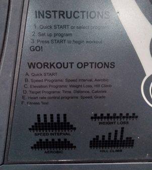
- The users did not know which button need to be pressed when the LCM screen displays “SELECT WORKOUT or PRESS START”.
- The LCM screen displays occurs “INPUT MAX.SPEED”, the user did not know what is the max speed stand for.
Mostly, there is no progress indicators. The users are not aware of the task progress, what had been done and what is left to do since the interface require multiple similar yet repetitive steps. The users can lose track of the intended tasks as they might focus more on how the interface works. Next, the interface did not help the users know how to do something at action level and what actions are needed to carry out their intention. For example, they cannot figure out on how to put the workout time as the interface shows design that does not include enough information for users to determine the correct action. The users cannot figure out what the symbol stand for (displayed on the LED screen of treadmill). On the other hand, the interface provides low noticeability and legibility for cognitive affordance. For example, the low contrast in colour for the instructions and labels. The interface also shows inconsistent presentation of cognitive affordance. For example, the numbers on the interface are used to input duration and also labelled with different programs. Last but not least, the cognitive affordances presented made users more confuse about the system functionality as many button sections for the same function.
Gulf of Evaluation
Execution requires both planning an action based on an understanding how the controls work, and actually manipulating the controls. Similarly, successful evaluation requires not just perceiving the system-status indicator, but also interpreting what it means. This type of granular, specific analysis of the interaction is important because success at one subtask does not necessarily mean success at the others. Determining whether something is on or off is a classic example of the gulf of evaluation; for this Bluetooth switch, it was easy to see both the switch and the label, but the visibility of these items did not necessarily mean they could be correctly interpreted.
The gulf of evaluation is also moderate. User has to spent a lot of effort to interpret changes in physical state of system and determine how well expectations and intentions have been met. User has difficulty of assessing the state of the system and how well the feedback supports the discovery and interpretation of that state. Also, user needs to expend significant attentional resources to interpret the state of the system and derive how well her expectations have been met.
For example;
- Most of the information occurs on the LCM screen is not clear. The user did not know what is “2 : 53” is stand for when the workout program is paused.
- The workout time occurs at LED screen is 30, but the user did not know what is 30 stand for.
- The users did not know what dotted graph on the LCM screen is stand for after choosing the workout program.

The interface provides a low clarity in term of content and meaning of cognitive affordances. For example, the user cannot figure out what the number displayed on the LED screen stands for. Next, the interface does not use direct and precise wording in labels and icons. For example, the HRC Speed, HRC Grade, Direct Speed Control where exist the cognitive indirectness. Last but not least, vague and ambiguous term are used and does not clearly represent work domain concept such as the Aerobic and Weight loss program.

Conclusion
The gulf of execution and gulf of evaluation is both moderate. This is because when device does not provide enough information about its state to be easily interpreted by user and it does not work like the way the user think it would. But it might be different between first time user who never had experience in using any type of treadmill before and first time user who has experiences in using other type of treadmill. The prior knowledge in using treadmill might help a little bit in guessing how the system of the interface works.
Ways to narrow the execution gulf is by putting progress information on the LED screen so the user can see his or her progress since the interface requires multiple repetitive steps, whether they are closer in achieving their goals. Next, remove the 4 seconds rule during the process of entering the input for workout time and max. speed. Use different buttons for different functions. For example, the Quick start and Start or Stop dan Pause are individual buttons. Plus, increase the noticeability and legibility of instructions and labels. For example, use high contrast in color and increase the size of instructions. The colour of Enter button, numerical button and speed and grade button need to be changed to light colour. This will increase the visibility of the buttons. On the other hand, put a symbol key in the instructions.
Ways to narrow the evaluation gulf is by making the buttons and labels larger and make them light up when pressed. This will helps the user to perceive any feedback after executing the intended actions. Then, the user can interpret the changes in order to give meaning of the tasks. Thus, user will be able to evaluate whether the goal is achieved or not.
